Showing posts with label design color. Show all posts

12 December 2011

creative endeavors: skyscrapers/cityscapes edition.

for the past couple weeks skyscrapers and cityscapes pretty much took hold of my studies, my artwork, everything, so I thought it would be fun to put some of it together and show you what I've been up to. (admittedly a bit after the fact. recent stuff is soon to come.)

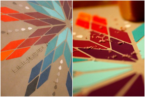
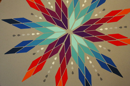
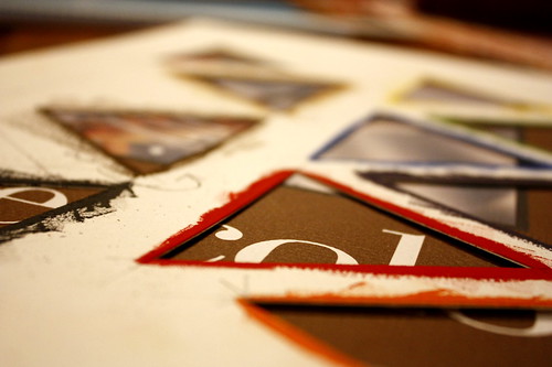
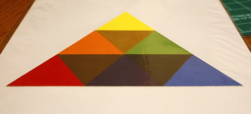
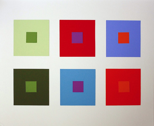
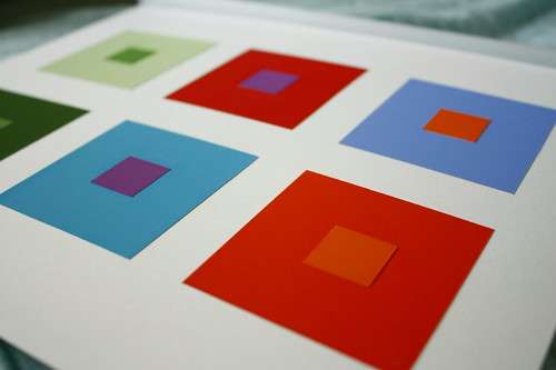
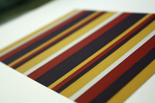
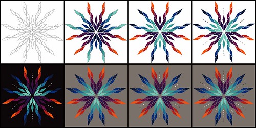
first up I'll show you my transparency design color project. it was pretty time consuming and frustrating and I think it's fair to say that everyone involved had hesitations as to whether it would come out. however, I think it did and it went over very well so I'm okay with all the work that went into it.
transA

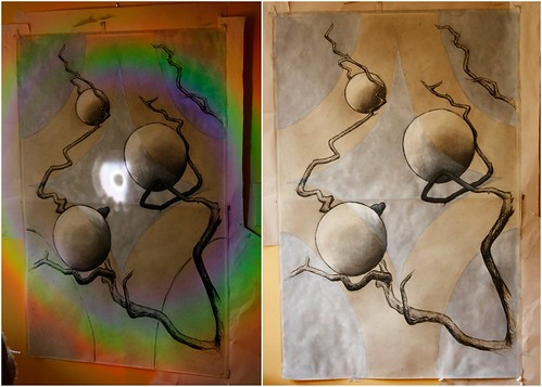
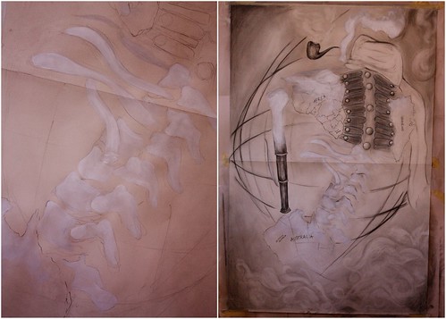
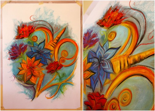
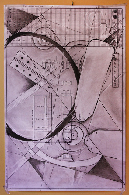
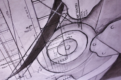
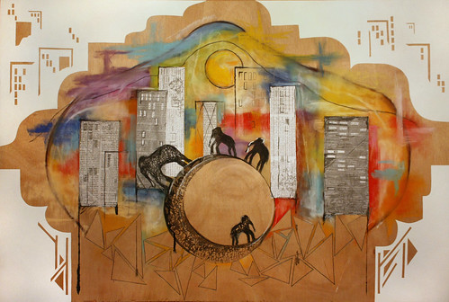
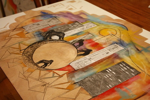
next is my wood drawing. this one I was equal parts excited and frustrated with. it went through many stages, with the initial study, the first stopping point, and then this, the final product. I'm pretty attached to it now though.
wood drawing
_MG_2234 (6)

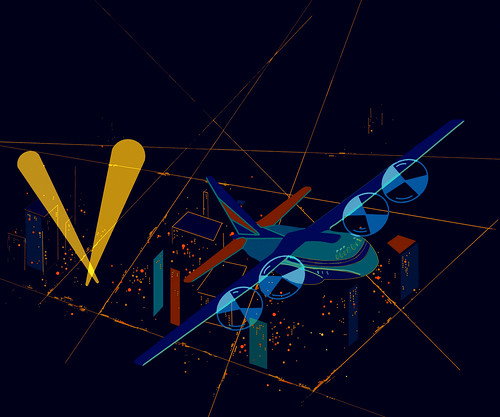
in the midst of all of this I came across this on little things, and it just made me smile.
justlittlethings

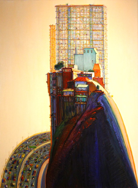
AND if all that wasn't enough, I was also writing about this work Apartment Hill by Wayne Theibaud. it's really a pretty terrific piece, and fit in nicely with all my studies of skyscrapers in art history. bam.
apartment hill by wayne thiebaud

and that's all folks.

23 November 2011

creative endeavors.

as crazy as it sounds, I think I'm finally bonding with my classes this semester. it's gotten to the point where I actually have enjoyed a project or two. what in the world haha.
anyways here is one of the last design projects I did. we had to take a section of our reference picture and mix pigments to match the colors in it, and then we had to take a section and create four different color harmonies.
Starred Photos56
_MG_2244
_MG_2241 (2)-1
Desktop

then here are the last two drawing projects I finished. the first one with the masks may be one of my favorite works of the whole semester. it's just so bright and fun.
Creative Endeavors9
Starred Photos57

that's all for now.

07 November 2011

the one where she shows she's still being creative.

admittedly it's been a while since I've done a creative endeavors post. there's a bit to catch up on, but thankfully I don't even have pictures of it all so this post can't be TOO obscenely long.
first, some of the last few design projects we've worked on, including the finished color temp design. woot!
then the last three drawings I have pictures of.

mounting in progress.
Starred Photos48
finished! (the colors are off in the picture though, sadly)
_MG_1979

then some tedious gouache work.
Starred Photos49
_MG_2139
_MG_2391
_MG_2386

then the drawings. check out what happens when the sunlight hits a cd and bounces onto a drawing!
Starred Photos46
Starred Photos47
and now we're on to pastels!
Creative Endeavors8

till next time folks. . .

06 October 2011

creative endeavors.

here are a couple of projects I've been working on lately in my studio classes.

first up is the design work. this one is one I showed a peek of before. it's the simultaneous contrast project.
the goal was to: column 1. make one value (dark/light) look like two, column 2. make one hue (color) look like two, and column 3. make one intensity (bright/dull) look like two. the middle square on each column is the same, but changes its appearance based on what it's placed on.
simultaneous contrast

this was a contrast of extension project. we were given four colors and had to create a design where no color had more importance than another using stripes of each.
contrast of extension

next is a drawing project I just turned in today. we had to make a structural line drawing on a blueprint. blueprints are fun.
basically we were to use the structure lines as a graphic element in our composition.
schematic blueprint drawing

29 September 2011

creative endeavors

I haven't shared any of my design work yet this semester so I think I'll do that now. I honestly don't have much to share because most of it is gone being graded and stuff, and I didn't get a chance to photograph it, but I have a couple fun peeks.

first is the simultaneous contrast project. more on that when I can show you the finished work. for now here's a look at it in the process of being mounted.
simultaneous contrast project

next is the project we're currently working on. it's the cold-warm contrast project.
this one is to be composed of two systems, each with at least five hues demonstrating a transitional shift in temperature. these systems are to be repeated in this design using at least twenty-five units of each.
this is just the computer mock-up I did to figure out my design, but it shows a bit of my process in getting to the final design. (it's the bottom right square, just fyi)
color temp project

and that's all for now folks.